Been doing some branding for Paris eCigarette retailer Sunny Smoker.
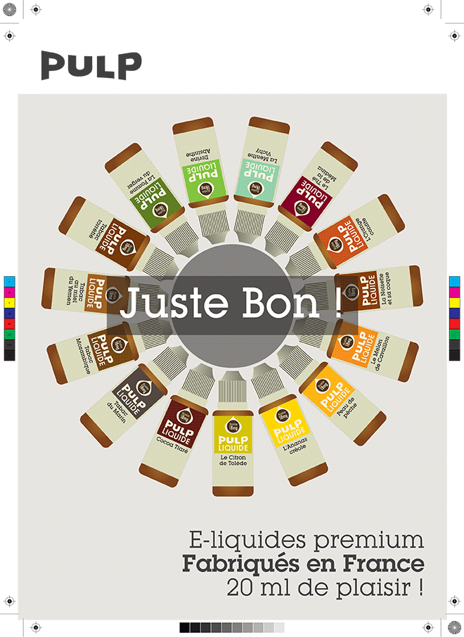
This is a part of the product lanch for their new brand- PULP Liquid
There’s a great story behind how this job evolved.
After having my interest piqued by the Company’s logo which was splashed on the window of their swanky Etienne Marcel store, I ventured inside. Searching for an alternative to Drum Blonde for wifelette @JulietteCream, I then became engaged in a discussion with the boss on the relative merits of the ‘Lobster’ font. He was a fan. I wasn’t.
Perhaps that’s because of its ubiquity wherever you look. Perhaps because its Google Font’. Perhaps because it’s the new Serpentine Sans, ie the typeface that was the standard ‘go-to’ wacky font on PC’s. Perhaps something else. The logo that drew me in was based on Lobster. Funny that. I think I was interested to see what else they had decided to use it for.
Anyway, to cut a long story short? he offered me a job to develop a brand style for a new range of E-cig liquids.
This is the result..